America's Best Idea - Part 1
Exploring America’s National Parks
National parks are the best idea we ever had. Absolutely American, absolutely democratic, they reflect us at our best rather than our worst.
- Wallace Stegner
I love America’s National Parks. The National Park Service administers 419 official units, of which 62 are designated National Parks, of which I’ve visited seven. My goal is to visit every single National Park, so I have a ways to go. And unfortunately, since I currently live on the eastern half of the United States, there are few parks close by. So, it could take a while.
In the meantime, I look forward to experiencing the National Parks any way I can. So, I was delighted to recently learn that detailed information for every unit in the National Park system is available to the public. So in the next few post I am going to explore this data set as a way learn more about our National Parks, and to continue expanding my analytic toolbox. The data for this project can be found here (make sure to select All Years, All Parks, and Summary Only? = False to get the full data set).
Before I get started I would like to make note of the follow articles that also dive into this data set. These articles were definitely an inspiration. In some instances in future posts I will probably replicate some of the visuals in these articles, but again I am treating these posts primarily as a learning exercise.
- The National Parks Have Never Been More Popular (accessed on 09/02/2019)
- Visualizing Our National Parks (accessed on 09/02/2019)
Libraries and Data
The following libraries were used for this analysis.
if (!require(pacman)) {install.packages('pacman')}
p_load(broom, data.table, janitor, plotly, png, readr, scales, stringr,
       tidyverse, urbnmapr)
The follow data sets were used for this analysis. The primary data was the National Park Service Annual Summary Report, 1904-2018. This data set provides annual visitor data going back to 1904. In 1979 the National Park Service began collecting far more detailed information, which I plan on investigating in future posts. Additional data for geographical information, state and US region data, and color palette information are also used in the analysis.
# NPS Visitors
file_path <- "./data/annual_summary_report_1904-2018.csv"
nps_summary <- read.csv(file_path,
                        stringsAsFactors = FALSE)

# Location and Region Information
file_path <- "./data/national_parks_location.csv"
list_np_locations <- read.csv(file = file_path,
                              stringsAsFactors = FALSE)

# NPS Region Color Table
file_path <- "./data/nps_region_colors.csv"
nps_region_colors <- read.csv(file_path,
                              stringsAsFactors = FALSE)

# List of States with Regions - Based on National Park Passports
file_path <- "./data/state_list.csv"
state_nps_region <- read.csv(file = file_path,
                             stringsAsFactors = FALSE)

# United States Shapefile - Alaska, Hawaii Inset
file_path <- "./data/us_state_map.RDS"
us_states <- readRDS(file = file_path)
As a personal preference I like a consistent case and labeling structure, so the data sets are appropriately cleaned using the janitor package.
nps_summary <- nps_summary %>%
  clean_names()

list_np_locations <- list_np_locations %>%
  clean_names()

nps_region_colors <- nps_region_colors %>%
  clean_names()

state_nps_region <- state_nps_region %>%
  clean_names()
Defining the Geographic Regions
Each National Park is assigned to a geographic region, based on regions of the National Park Passport System. Use of this system is fairly arbitrary, but I’m a fan of the Passport System and am familiar with its regional breakdowns. I will also maintain the color palette used in the Passport System.
#Assign Colors to NPS Regions
color_map <- setNames(nps_region_colors$html_color_code_stamps,
                      nps_region_colors$nps_region)
To visualize the regions I developed the following state level choropleth. Washington DC was removed as DC functions as it’s own region, but is not visible on the map.
# Data Frame with State, Region, and FIPS code
state_nps_region <- state_nps_region %>%
  left_join(select(statedata,state_fips:state_name)
            , by = "state_name") %>%
  select(state_fips, state_name, everything())

# Join to Shapefile - Remove DC
us_states_region <- us_states %>%
  left_join(
    select(state_nps_region, state_fips, region),
            by = "state_fips") %>%
  filter(state_fips != "11")        # Remove Washington D.C.

# List of Regions
us_regions <- c("Mid-Atlantic", "Midwest", "North Atlantic",
                "PNW & Alaska", "Rocky Mountain", "Southeast",
                "Southwest", "Western")

# ggplot Visual
ggplot() +
  geom_polygon(
    data = us_states_region
  , mapping = aes(x = long, y = lat, group = group, fill = region)
  , color = "gray90"
  , alpha = 0.75
  , size = 0.25) +
  scale_fill_manual(
    values = color_map,
    labels = us_regions
   ) +
  labs(fill = "") +
  coord_sf(datum = NA) +
  labs(title = "United States Geographical Regions"
       , subtitle = "Based on National Park Passport Program") +
  xlab(label = "") +
  ylab(label = "")+
  theme_minimal() +
  theme(
    legend.position = "right"
  )
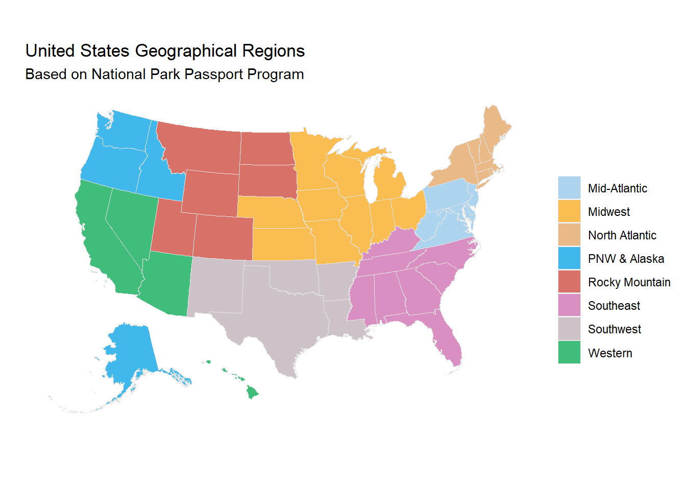
Note that there are National Parks in American Samoa and Puerto Rico, both not pictured. American Samoa is part of the Western region, Puerto Rico part of the Southeast region.
Data Cleaning and Preparation
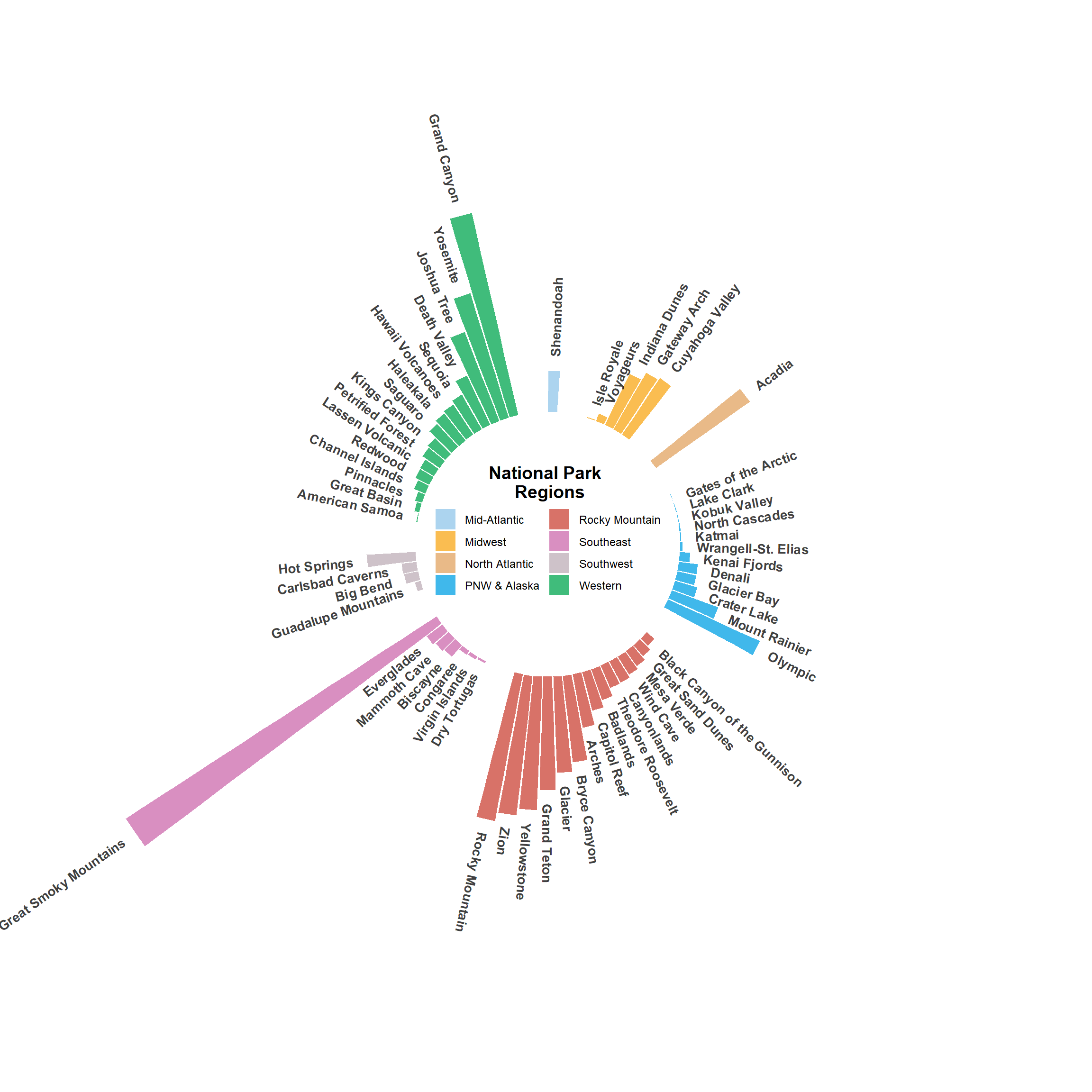
The end goal for this first post is to create a circular bar chart, showing the percent of total annual visitors each park received in 2018, with the parks grouped by geographical region, and ordered by visitor levels, to the order bars graph in the R Graph Gallery.
The first step is to take the data from all the National Park System sites and reduce it to the major National Parks.
#Add NP to American Samoa Name for Downstream Filters
#Remove National Park from the name. This is a formatting choice.
nps_summary$park_name <- str_replace_all(nps_summary$park_name
                                               , "National Park of American Samoa"
                                               , "American Samoa NP")

#Filter for National Park (NP) and National Preserve (NPRES)
#This is due to some national parks also being National Preserves
nps_summary_np <- nps_summary %>%
  filter(str_detect(string = park_name, " NP")) %>%
  filter(str_detect(string = park_name, " NPRES") == FALSE)

#Join Location Data by park_name
nps_summary_np <- nps_summary_np %>%
  left_join(y = list_np_locations, by = c("park_name"))

#Filter Down to Only Park Name
nps_summary_np$park_name <- str_remove_all(nps_summary_np$park_name,
                                           " NP")

nps_summary_np$park_name <- str_remove_all(nps_summary_np$park_name,
                                           " & PRES")

#Filter Out Wolf Trap
nps_summary_np <- nps_summary_np %>%
  filter(park_name != 'Wolf Trap for the Performing Arts')

# Select Essential Variables
nps_summary_np <- nps_summary_np %>%
  select(park_name:recreation_visitors, np_id:nps_region)
Now with a data set of only National Parks the data can be processed for use in a circular bar chart. For this chart we only care about the 2018 data.
#Filter for 2018
nps_summary_np_2018 <- nps_summary_np %>%
  filter(year == 2018)

# Calculate Percent Visit
nps_summary_np_2018 <- nps_summary_np_2018 %>%
  mutate(percent_visit = round(
    recreation_visitors/sum(recreation_visitors)*100
    ,digits = 2))

#Make NPS Region a Factor
nps_summary_np_2018$nps_region <- as.factor(nps_summary_np_2018$nps_region)

#Arrange Data Input
 nps_summary_np_2018 <- nps_summary_np_2018 %>%
  arrange(nps_region, recreation_visitors)

# Set a number of 'empty bars' to add at the end of each group for spacing
empty_bar <- 3
to_add <- data.frame( matrix(NA, empty_bar*nlevels(nps_summary_np_2018$nps_region),
                             ncol(nps_summary_np_2018)))
colnames(to_add) <- colnames(nps_summary_np_2018)
to_add$nps_region <- rep(levels(nps_summary_np_2018$nps_region),
                         each=empty_bar)
nps_summary_np_2018 <- rbind(nps_summary_np_2018, to_add)
nps_summary_np_2018 <- nps_summary_np_2018 %>%
  arrange(nps_region)
nps_summary_np_2018$np_id <- seq(1, nrow(nps_summary_np_2018))

#Assign Labels to the Bars
labels <- nps_summary_np_2018

# Calculate the angle of the labels
number_of_bar <- nrow(labels)

angle <- 90 - 360 * (labels$np_id - 0.5) / number_of_bar

# Substract 0.5 because the letter must have the angle
# of the center of the bars.
# Not extreme right(1) or extreme left (0)

# Calculate the alignment of labels: right or left
labels$hjust <- ifelse( angle < -105, 1, 0)

# Flip angle by to make them readable
labels$angle <- ifelse(angle < -105, angle + 180, angle)
With a processed data frame the bar chart can be created.
# Reduce Margins
margin_indent <- -5

p_297 <-
  ggplot(data = nps_summary_np_2018,
          mapping = aes(x = as.factor(np_id),
                        y = percent_visit,
                        group = nps_region,
                        fill = nps_region)
         ) +
  geom_bar(
    stat = "identity",
    alpha = 0.75
    ) +
  coord_polar() +
  geom_text(
    data = labels,
    mapping = aes(
      x = np_id,
      y = percent_visit + 0.5,
      label = park_name,
      hjust = hjust
      ),
    color = "black",
    fontface = "bold",
    alpha = 0.75,
    size = 3.7,
    angle = labels$angle,
    inherit.aes = FALSE
          ) +
  # Split Legend into two columns
  guides(fill = guide_legend(ncol=2)) +
  scale_fill_manual(
    values = color_map,
    labels = us_regions
   ) +
  # Set Axis. Negative y corresponds to size of center circle
  ylim(-4.75, 16) +
  labs(fill = "National Park \n Regions") +
  theme_minimal() +
  theme(
    axis.text = element_blank(),
    axis.title = element_blank(),
    legend.title =  element_text(size = 14,face="bold"),
    legend.title.align = 0.5,
    legend.text = element_text(size = 9),
    panel.grid = element_blank(),
    # This remove unnecessary margin around plot
    plot.margin = margin(margin_indent, margin_indent,
                         margin_indent, margin_indent, "cm"),
    legend.position = c(0.5,0.51)
    )

ggsave(plot = p_297, filename = "np_radial_bar.png",
       scale = 2, path = "./images/")
## Saving 24 x 24 in image
p_297