North Carolina Spending on Children - #TidyTuesday
 NC Spending on Kids
For #TidyTuesday this week the subject is US Government Spending on children, from 1997 through 2016. The dataset was compiled by the Urban Institute. In this post I am going to walk through how I created my #TidyTuesday submission. The link to the data is below.
Link: https://github.com/rfordatascience/tidytuesday/blob/master/data/2020/2020-09-15
Load
The first step in developing our visual is to load the packages we’ll need and the dataset. For packages, I am using the skimr package to better inspect the data, and the packages in the tidyverse wrapper for all data manipulation and visuals.
Packages
if (!require(pacman)) {install.packages('pacman')}
p_load(
  RColorBrewer,
  skimr,
  tidyverse
  )
Data
data_url <- "https://raw.githubusercontent.com/rfordatascience/tidytuesday/master/data/2020/2020-09-15/kids.csv"
kids_input <- readr::read_csv(data_url)
Inspect the Data
with our data and packages loaded, we’ll first do a quick inspection of the data. I like to us the skim* function from the **skimr** package.
kids_input %>% skimr::skim()
| Name | Piped data |
| Number of rows | 23460 |
| Number of columns | 6 |
| _______________________ | |
| Column type frequency: | |
| character | 2 |
| numeric | 4 |
| ________________________ | |
| Group variables | None |
Variable type: character
| skim_variable | n_missing | complete_rate | min | max | empty | n_unique | whitespace |
|---|---|---|---|---|---|---|---|
| state | 0 | 1 | 4 | 20 | 0 | 51 | 0 |
| variable | 0 | 1 | 3 | 13 | 0 | 23 | 0 |
Variable type: numeric
| skim_variable | n_missing | complete_rate | mean | sd | p0 | p25 | p50 | p75 | p100 | hist |
|---|---|---|---|---|---|---|---|---|---|---|
| year | 0 | 1 | 2006.50 | 5.77 | 1997.00 | 2001.75 | 2006.50 | 2011.25 | 2016.00 | ▇▇▇▇▇ |
| raw | 102 | 1 | 1181358.99 | 3558686.72 | -60139.00 | 71985.25 | 252002.40 | 836324.50 | 83666088.00 | ▇▁▁▁▁ |
| inf_adj | 102 | 1 | 1359982.97 | 3998940.10 | -60799.48 | 85875.76 | 298777.56 | 985048.61 | 84584960.00 | ▇▁▁▁▁ |
| inf_adj_perchild | 102 | 1 | 0.91 | 1.68 | -0.01 | 0.12 | 0.33 | 0.83 | 20.27 | ▇▁▁▁▁ |
Key Takeaways
- Yearly data from 1997 - 2016 (we also knew this from the data description)
- State variable has 51 values, so probably the 50 states plus Washington D.C.
- There are 23 values under variable
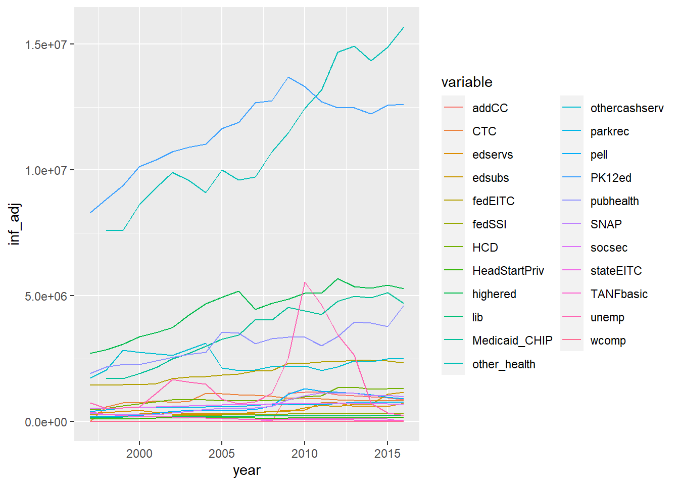
I’m most curious about the what data is in the variable column. The tidykids codebook has a detailed breakdown of each variable ( here). This certainly provides some context, but not the scope of the spending. So, lets do a quick and dirty plot of the inflation adjusted spending for all variables. I live in North Carolina, so I’m going to limit this view to just my home state.
kids_input %>%
  filter(state == 'North Carolina') %>%
  ggplot(
    aes(
      x = year,
      y = inf_adj,
      color = variable
    )
  ) +
  geom_line()
Key Takeaways
- Large amount of spending is directed at two variables: PK12ed and other_health.
- Large spike in unemp spending between 2008 and 2014
- Large deviation in PK12ed spending from 2009 on that has largely not recovered.
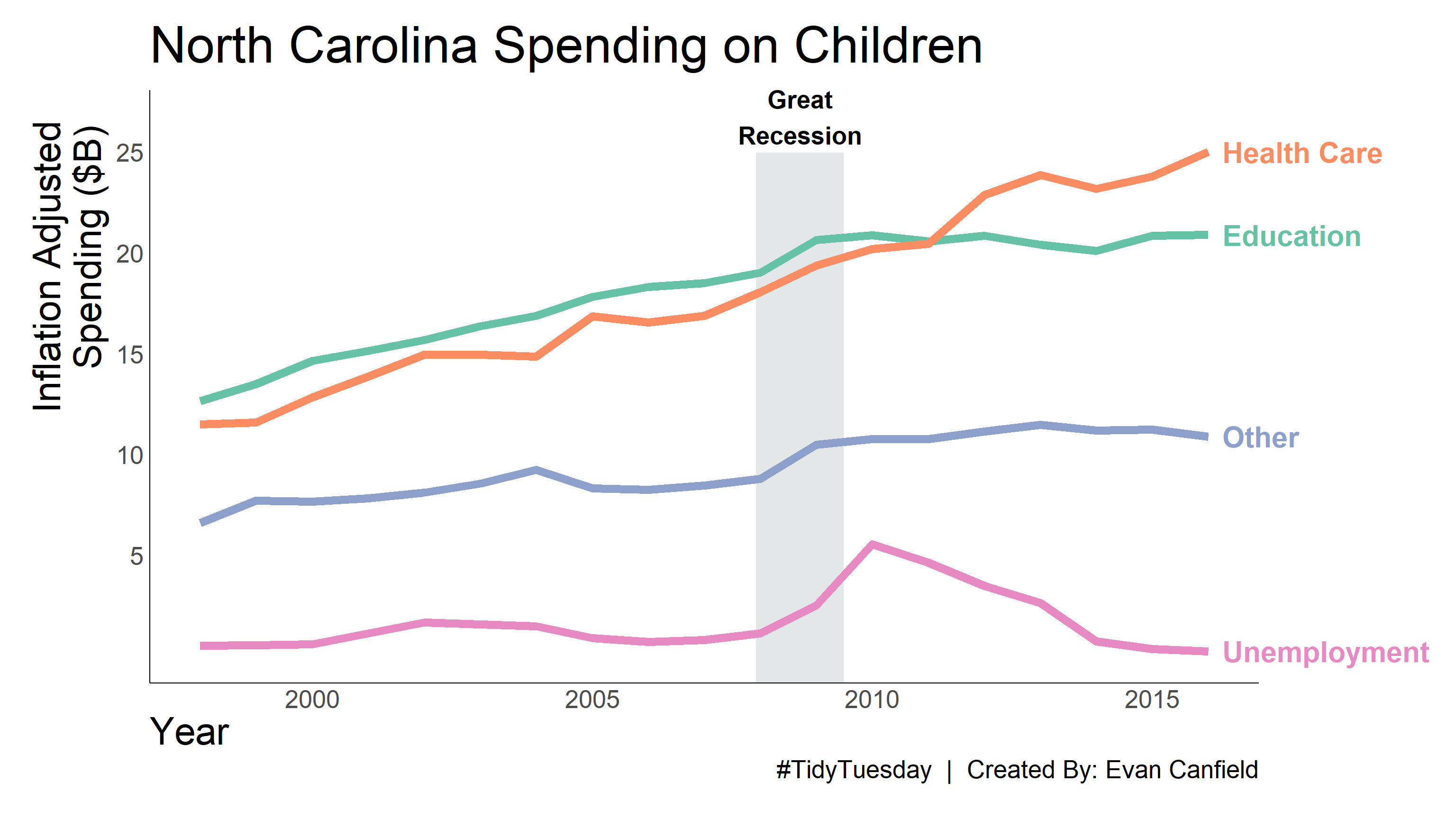
So, I think it’s pretty clear that the Great Recession caused a great change in spending after 2008. Unemployment rose, and primary and secondary education spending fell. Interestingly, general healthcare costs did not fall. They generally stayed on the same trajectory pre-2008.
#TidyTuesday Visual
For my #TidyTuesday visual, I want to explore the relationship between education and healthcare spending in North Carolina. To do this, we’re going to reduce the number of variables from 23 to 4. The four variables will be:
- Education
- Healthcare
- Unemployment
- Other
First, we’ll create lists to define what variable belongs to healthcare and what variable belongs to education. Variable definition will be a judgement call, based on the descriptions of each variable in the tidykids codebook.
variable_edu <- c("PK12ed", "highered", "edsubs", "edservs",
                  "pell", "HeadStartPriv")
variable_health <-c("Medicaid_CHIP", "pubhealth", "other_health")
With these lists defined, we’ll create our visual data set. To generate the dataset, we’ll take the following actions:
- Define new variable which labels each observation as one of the four new variable categories.
- Limit the data to only North Carolina.
- Drop data from 1997, as some data is missing that year, primarily from healthcare.
- Convert to Inflation Adjusted spending from thousands to billions.
kids_nc_new_var <- kids_input %>%
  filter(year > 1997) %>%
  filter(state == "North Carolina") %>%
  mutate(new_var =
           case_when(
             variable %in% variable_edu ~ "Education",
             variable %in% variable_health ~ "Health Care",
             variable == "unemp" ~ "Unemployment",
             TRUE ~ "Other"
           ),
         inf_adj = inf_adj/1e6
  ) %>%
  group_by(year, new_var) %>%
  summarise(inf_adj = sum(inf_adj, na.rm = TRUE)) %>%
  ungroup()
With our dataset created, we can generate the final visual.
I like to define most of my visual plot setting and theme in a separate function. It’s good for consistency, particularly if you are making multiple plots in the same style.
# Color Pallette
color_pal <- c(
  "Education" = "#132743",
  "Health Care" =  "#70adb5",
  "Unemployment" = "#407088",
  "Other" = "#ffcbcb"
          )

# Grey Block Dimension
block_xmin = 2007 + 11/12
block_xmax = 2009 + 6/12
block_ymin = -Inf
block_ymax = 25

# Theme
theme_nc <- function(){
    theme_classic() +
    theme(
      legend.position = "none",
      axis.ticks = element_blank(),
      axis.text.x = element_text(
        size = 20
        ),
      axis.title.x = element_text(
        size = 30,
        hjust = 0
        ),
      axis.title.y = element_text(
        size = 30,
        hjust = 0.90,
        vjust = 1.5
        ),
      axis.text.y = element_text(
        size = 20
        ),
      plot.title = element_text(
        size = 40,
        hjust = 0,
        vjust = 2
        ),
      plot.caption = element_text(
        size = 20
        ),
      plot.margin = unit(c(1,5.5,1,1) , "cm")
    )
}
With the visual settings defined, we can then apply them to the visual.I have added some background color and annotation to indicate when the Great Recession occurred, December 2007 through June 2009. This of course is only the period of the recession. The recovery took far longer.
p <- ggplot(data = kids_nc_new_var,
            aes(
              x = year,
              y = inf_adj,
              color = new_var
              )
            ) +
  annotate(geom = "rect",
      xmin = block_xmin,
      xmax = block_xmax,
      ymin = block_ymin,
      ymax = block_ymax,
    color = "white",
    fill = "#CACFD2",
    alpha = 0.5
  ) +
  geom_line(
    size = 3
  ) +
  geom_text(
    data = kids_nc_new_var %>% filter(year == 2016),
    aes(
      label = new_var,
      x = year,
      y = inf_adj
      ),
    nudge_x = 0.25,
    hjust = "left",
    size = 8,
    fontface = "bold"
  ) +
  annotate(
    geom = "text",
    label = "Great\nRecession",
    x = (block_xmin + block_xmax) / 2,
    y = 26.75,
    color = "black",
    size = 7,
    fontface = "bold"
  ) +
  scale_x_continuous(
    breaks = seq(2000, 2016, 5)
    ) +
  scale_y_continuous(
    breaks = seq(5, 25, 5),
    limits = c(0,26.75)
    ) +
  # scale_color_manual(values = color_pal) +
  scale_color_brewer(palette = "Set2") +
  coord_cartesian(
     clip = "off",
     xlim = c(1998, 2016)
  ) +
  xlab("Year") +
  ylab("Inflation Adjusted\nSpending ($B)") +
  labs(
    title = "North Carolina Spending on Children",
    caption = "#TidyTuesday  |  Created By: Evan Canfield"
    ) +
  theme_nc()

p